
Have you ever walked into a room and instantly felt a certain way – energized, relaxed, or inspired? Chances are, the colors used in that space played a significant role in evoking those emotions. Impact of Color in home decor is one of the most powerful tools in interior design, capable of transforming the look and feel of any room. By understanding the psychology of color and how to apply it effectively, you can create a home that not only looks beautiful but also enhances your mood and well-being.
Key Takeaways
- Color psychology plays a crucial role in interior design, influencing the mood and atmosphere of a space
- Different colors evoke specific emotions and feelings, from calming blues to energizing reds
- Factors like lighting, texture, and personal preferences can impact color perception
- Choosing the right color palette and incorporating a mix of colors and neutrals is key to creating a cohesive, visually appealing design
- Staying up-to-date on color trends while considering practical factors can help you create a personalized, impactful space
Understanding Color Psychology
The Basics of Color Psychology
To effectively use color in interior design, it’s important to understand the fundamentals of color psychology. The color wheel is a helpful tool for visualizing the relationships between different hues:
- Primary colors: Red, blue, and yellow
- Secondary colors: Green, orange, and purple (created by mixing primary colors)
- Tertiary colors: Combinations of primary and secondary colors, like blue-green or red-orange
Colors can also be categorized as warm or cool. Warm colors, like red, orange, and yellow, are associated with energy, passion, and excitement. Cool colors, such as blue, green, and purple, evoke feelings of calmness, serenity, and relaxation.
The Psychological Effects of Color
Each color has its own unique psychological impact:
| Color | Psychological Effects |
|---|---|
| Red | Passion, energy, excitement |
| Blue | Calmness, serenity, trust |
| Green | Harmony, growth, renewal |
| Yellow | Happiness, optimism, creativity |
| Purple | Luxury, creativity, introspection |
| Neutrals | Sophistication, balance, minimalism |
Factors that Influence Color Perception
It’s important to note that color perception can be influenced by various factors, including:
- Lighting: Natural and artificial light can significantly impact how a color appears in a space
- Texture: Matte, glossy, or textured surfaces can alter the perceived depth and tone of a color
- Surrounding colors: The colors used in adjacent spaces or on nearby furnishings can affect how a particular hue is perceived
- Personal preferences and experiences: Cultural associations, individual memories, and personal taste can shape one’s response to color
Applying Color Psychology in Interior Design
Choosing the Right Color Palette
Creating a cohesive, impactful color scheme is essential for successful interior design. Here are some tips for selecting the perfect palette:
- Use the color wheel to choose complementary (opposite), analogous (adjacent), or monochromatic (varying shades of one color) schemes
- Consider the desired mood and atmosphere for each space
- Incorporate a mix of warm and cool tones for balance and visual interest
- Use accent colors strategically to add depth and personality
Incorporating Color in Different Spaces
The colors you choose for each room should align with the space’s intended function and desired ambiance. Here are some guidelines for using color psychology in various areas of your home:
- Bedrooms: Opt for calming, relaxing colors like blues, greens, and soft neutrals to promote restfulness
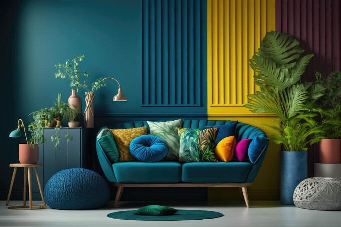
- Living rooms: Choose warm, inviting colors like reds, oranges, and earth tones to encourage socialization and comfort
- Kitchens: Bright, energizing colors like yellows and greens can boost creativity and appetite
- Home offices: Focused, productive colors like blues and grays can enhance concentration and clarity
- Bathrooms: Serene, refreshing colors like blues, greens, and crisp whites can create a spa-like atmosphere
Balancing Color and Neutrals
While color is a powerful design tool, it’s equally important to incorporate neutral tones for balance and versatility. Neutrals like white, black, gray, and beige can serve as a foundation, allowing bolder accent colors to pop.
Here are some tips for achieving a harmonious mix of color and neutrals:
- Use neutrals for larger surfaces like walls, floors, and furniture pieces
- Add color through accents like throw pillows, artwork, and decorative objects
- Incorporate natural elements and textures, like wood, stone, and plants, to add depth and warmth to a neutral scheme
- Experiment with different shades and tones of neutrals to create subtle contrast and visual interest
Trends and Considerations
Emerging Color Trends in Interior Design
Color trends in interior design are constantly evolving, influenced by cultural, societal, and environmental factors. Some notable trends in recent years include:
- Earthy tones: Warm, nature-inspired hues like terracotta, olive green, and mustard yellow
- Bold jewel tones: Rich, saturated colors like emerald green, sapphire blue, and ruby red used as accents
- Minimalist palettes: Continued popularity of crisp whites, soft grays, and barely-there neutrals for a clean, modern look
- Pastel pops: Soft, muted shades of pink, blue, and green used to add a playful, whimsical touch
While it’s fun to experiment with trendy colors, it’s important to choose a palette that resonates with your personal style and the overall aesthetic of your home.
Factors to Consider When Choosing Colors
In addition to understanding color psychology and staying up-to-date on trends, there are several practical factors to consider when selecting colors for your home:
- Lighting: Consider the amount and quality of natural light in each room, as well as the type of artificial lighting used
- Room size: Lighter colors can make a small space feel larger, while darker hues can create a cozy, intimate atmosphere in a larger room
- Personal preferences: Choose colors that reflect your personality, evoke positive emotions, and create a space that feels authentic to you
- Functionality: Consider the practical needs of each room, such as durability, maintenance, and the potential for color to impact tasks like sleeping or working
Conclusion
Color is a powerful tool in interior design, capable of transforming the look, feel, and atmosphere of any space. By understanding the psychology of color and how to apply it effectively, you can create a home that not only looks beautiful but also enhances your mood and well-being.
Remember to choose colors that align with the desired function and ambiance of each room, incorporate a mix of warm and cool tones, and balance bold hues with neutral foundations. Stay up-to-date on emerging color trends while prioritizing your personal style and practical considerations.
Most importantly, have fun experimenting with color and using it to create a space that truly reflects your unique personality and lifestyle. With a thoughtful approach to color psychology, you can unlock the transformative power of color and create a home that is both visually stunning and emotionally resonant.